CASE STUDY


GOAL
Camp Horsin’ Around’s marketing committee, comprised of board and staff members, reached out to Wiser Strategies to discuss their need for an updated website that provided a clear user experience and a simplified, cohesive look.
APPROACH
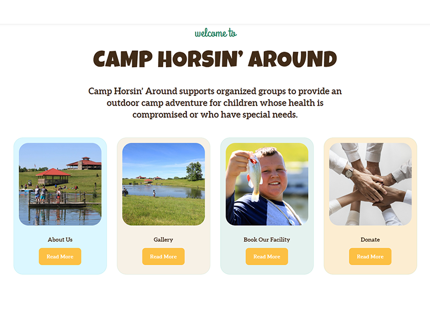
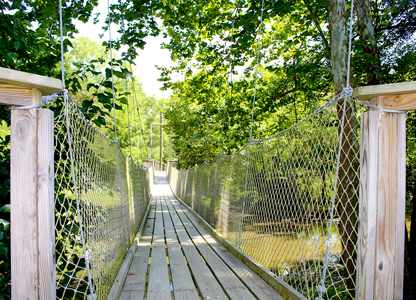
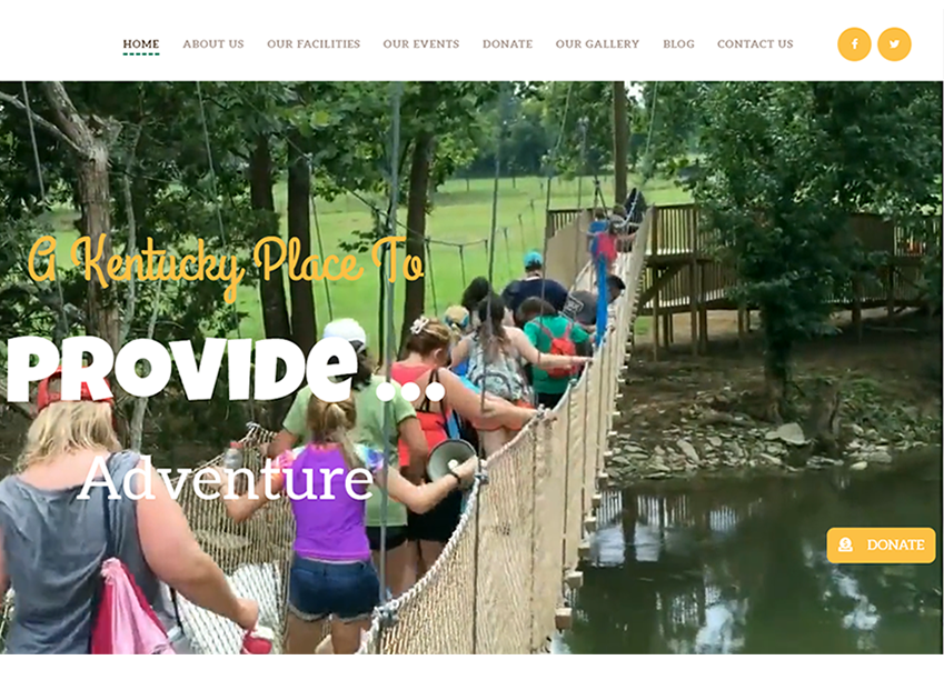
To simplify the user experience, we condensed the important information into seven pages. We developed a theme that would focus on the camp property as well as the activities and benefits it provides. “A Kentucky Place To …” opened the door to more clearly tell the message. We also aimed to keep the pages clean but incorporate the CHA brand more prominently by selecting a font for headings and content, pulling the colors from the logo to use as accents, and using original photography for a more authentic feel.


